Forte: Melodies You Missed
Deliverables
Full Issue 1
further issue covers
Client
University project
date
2024
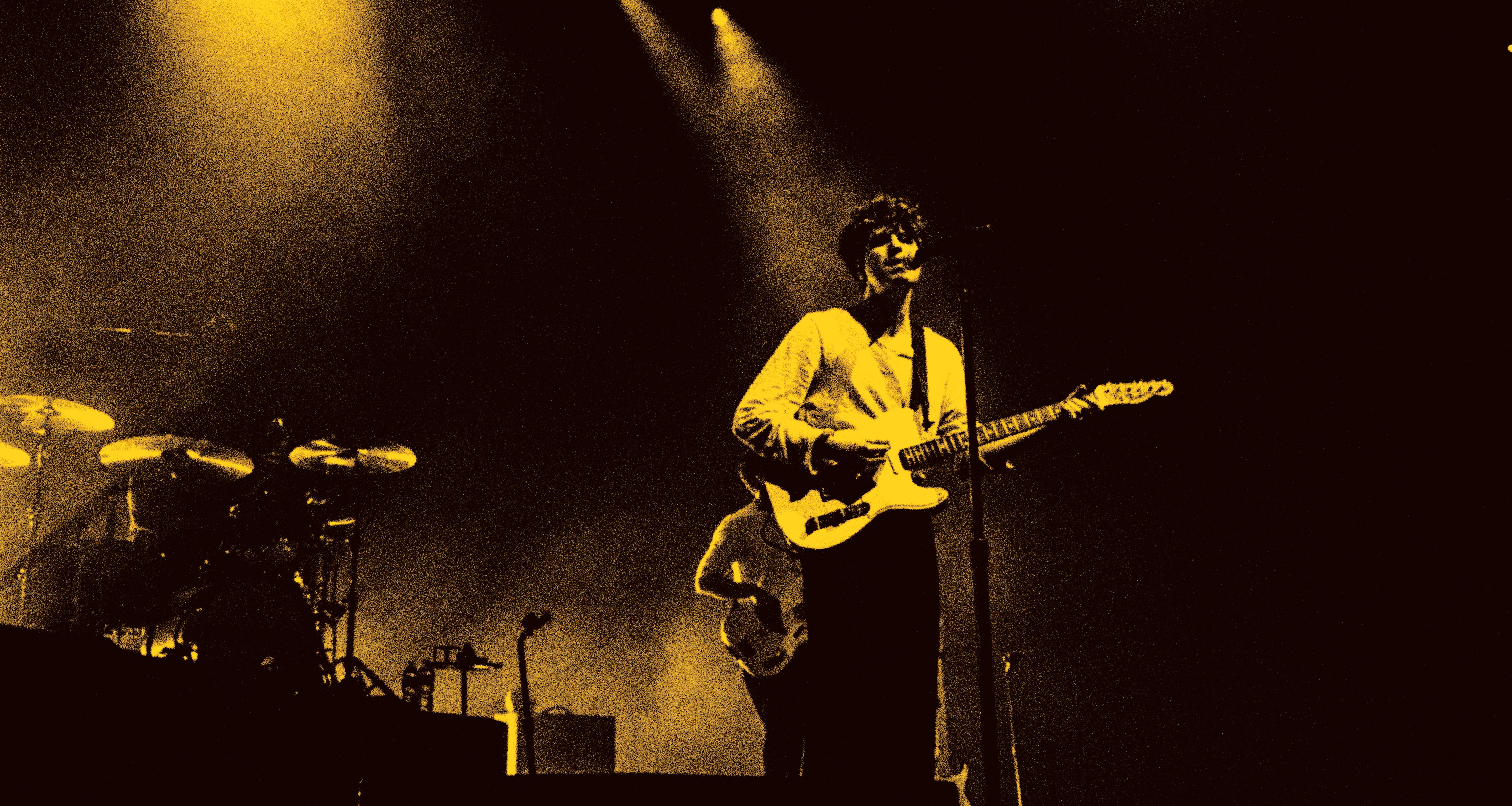
Arguably my favourite project I have completed, I created an independent magazine, Forte. A magazine concept that is catered to music enthusiasts with an interest in finding new music or new artists. It focuses on forgotten and/or hidden gems in the music scene. This includes cult favourite bands, smaller albums, unreleased projects, or one-hit wonders. Each issue aims to cover new genres so that people can expand their music taste or fall back in love with buried music.
The target audience is people of any age because music can be catered to all ages. However in the design style I aimed to cater it to an audience of younger adults aged 18–25 with exciting image treatment and typography. Each issue includes interviews, album reviews, artist profiles, music rankings etc.
View and download the full first issue here.

Process
Cover Ideation
During my design process, the element with the most design iterations was the front cover. Creating an artistic image to cement Forte as an independent magazine, whilst still portraying a theme of music was a difficult task. On top of this, a strong visual identity had to be created to allow covers from different issues to be distinct, yet recognisable as a Forte publication.
Typography
Although image treatment was crucial for the design of the covers and standout interior pages, typography was equally important in aiding the visual identity of the magazine. The typographic treatment was also crucial for the legibility of the articles included in the magazine. I was able to create an exciting visual experience by combining both reading and display fonts, with different image styles.


Outcome
Issue 1
The first issue of Forte Magazine focuses on Hip Hop. I was able to create a full magazine using colour and texture as intriguing visual elements, alongside successfully handled typography which allowed for a smooth reading experience with intentional friction in desired areas. This structure and design makes for an exciting user experience providing information and visual stimulation. See the full first issue here.
Following Issue Covers
The following issues 2,3,4, and 5 follow the same design principles as the first issue, using relevant genre imagery. A key change between issues is the colour scheme used, which always follows the same rules with a solid dark background and bright accompanying colour to create a deep contrast. A consistent element is the stamp-like design, involving the masthead, issue title and tag line. This is always found in the same position and orientation, reinforcing the consistent visual identity.


Southport
Merseyside
United Kingdom
2026
Instagram: @jackswaindesign